Kopex Ajvar — packaging that shuns traditional design tropes
Year: 2023
Not many foods can boast the status of a cultural heritage. One of such proud delicacies is “ajvar”- the traditional roast pepper spread or a homemade jam made of healthy and sunbathed fruits adored throughout much of Southeast Europe. Strongly embedded in the Balkan’s gastro culture, both ajvar and jam have become symbols of the region’s well-known gourmet cuisine, loved and enjoyed in households across countries and in all seasons. Kopex is a micro brand that brings these domestic condiments to the table straight from the heart of Serbia’s famous Kopaonik mountain.
Client: Kopex, Serbia
Services: Packaging + Illustration + Print
Creative Direction: Kosta Rakićević
Design: Nina Hadživuković Mrvoš
Illustration: Nina Hadživuković Mrvoš
Animation: Nataša Stamatović
Photography: Nataša Stamatović

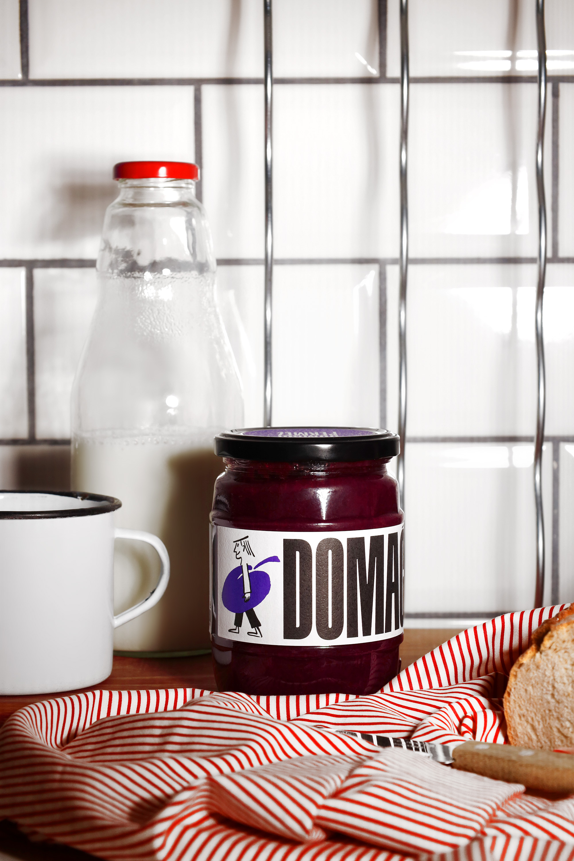
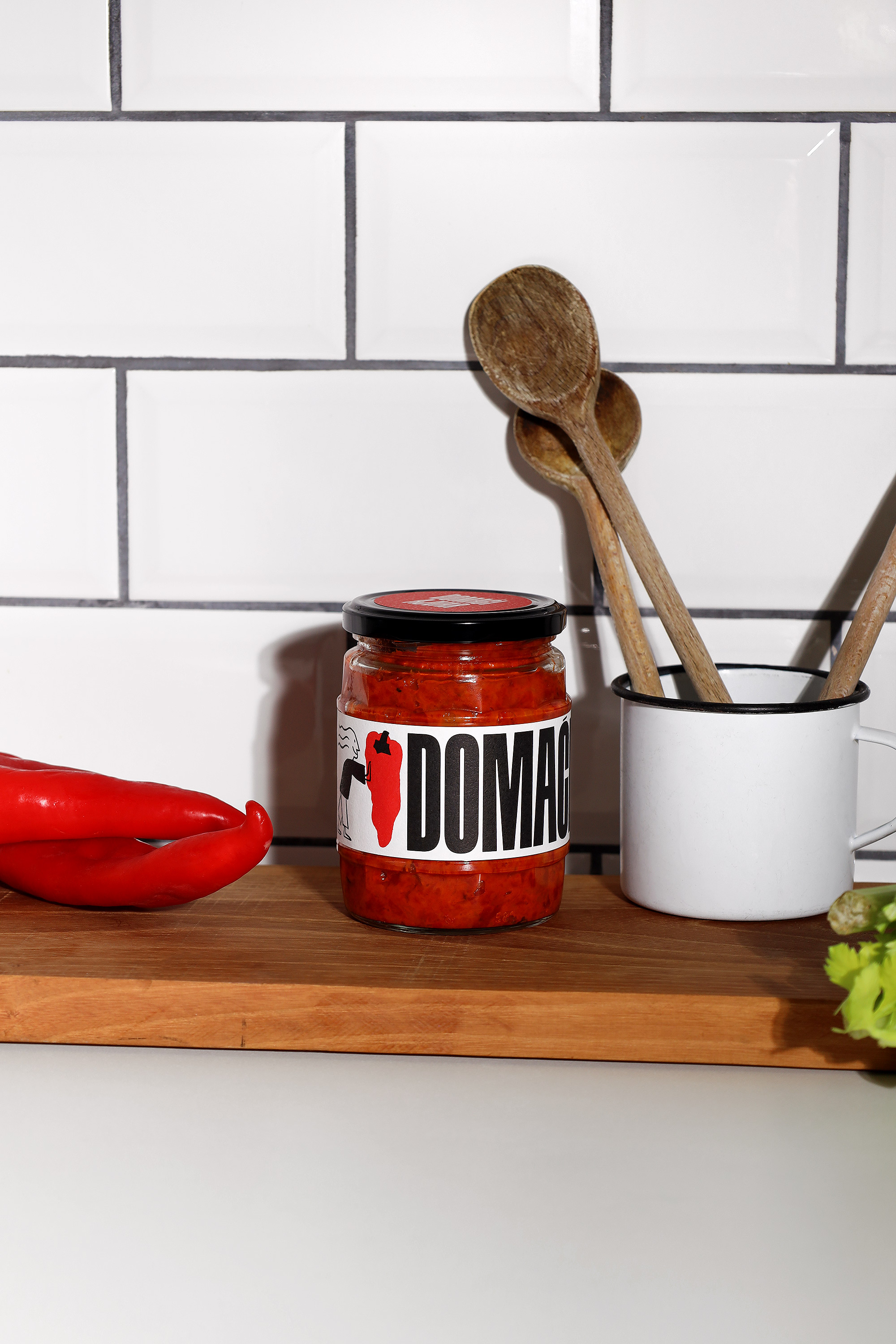
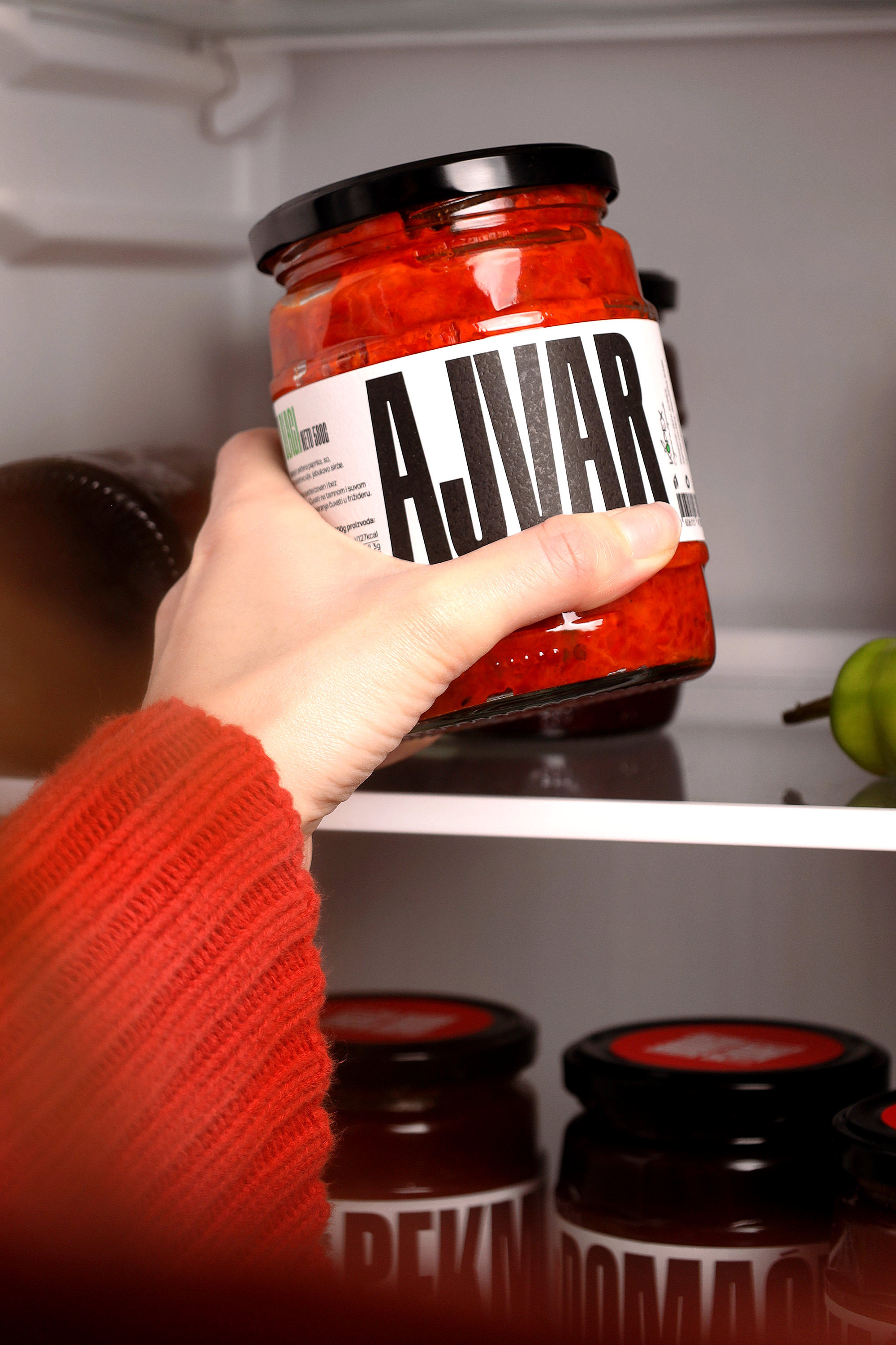
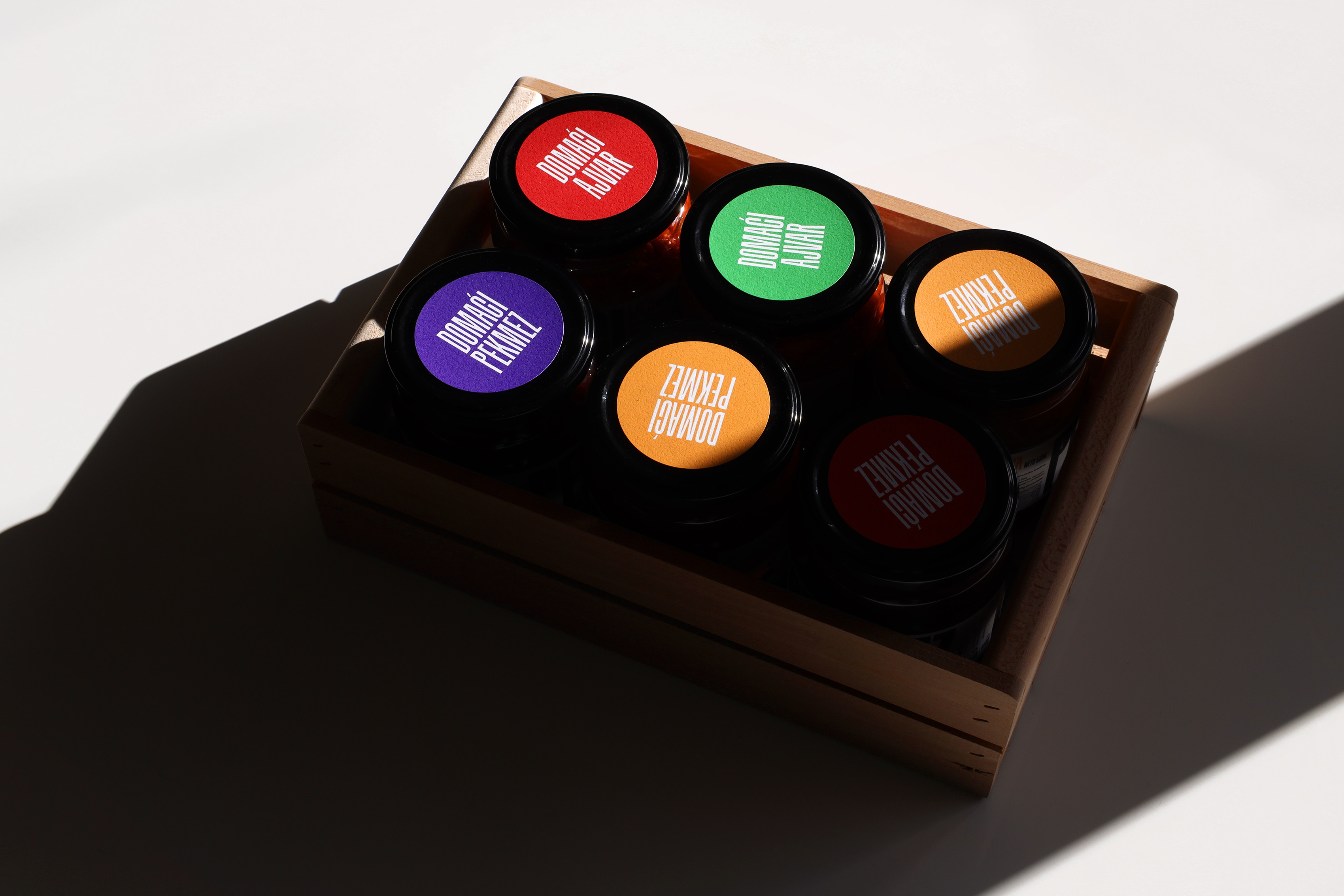
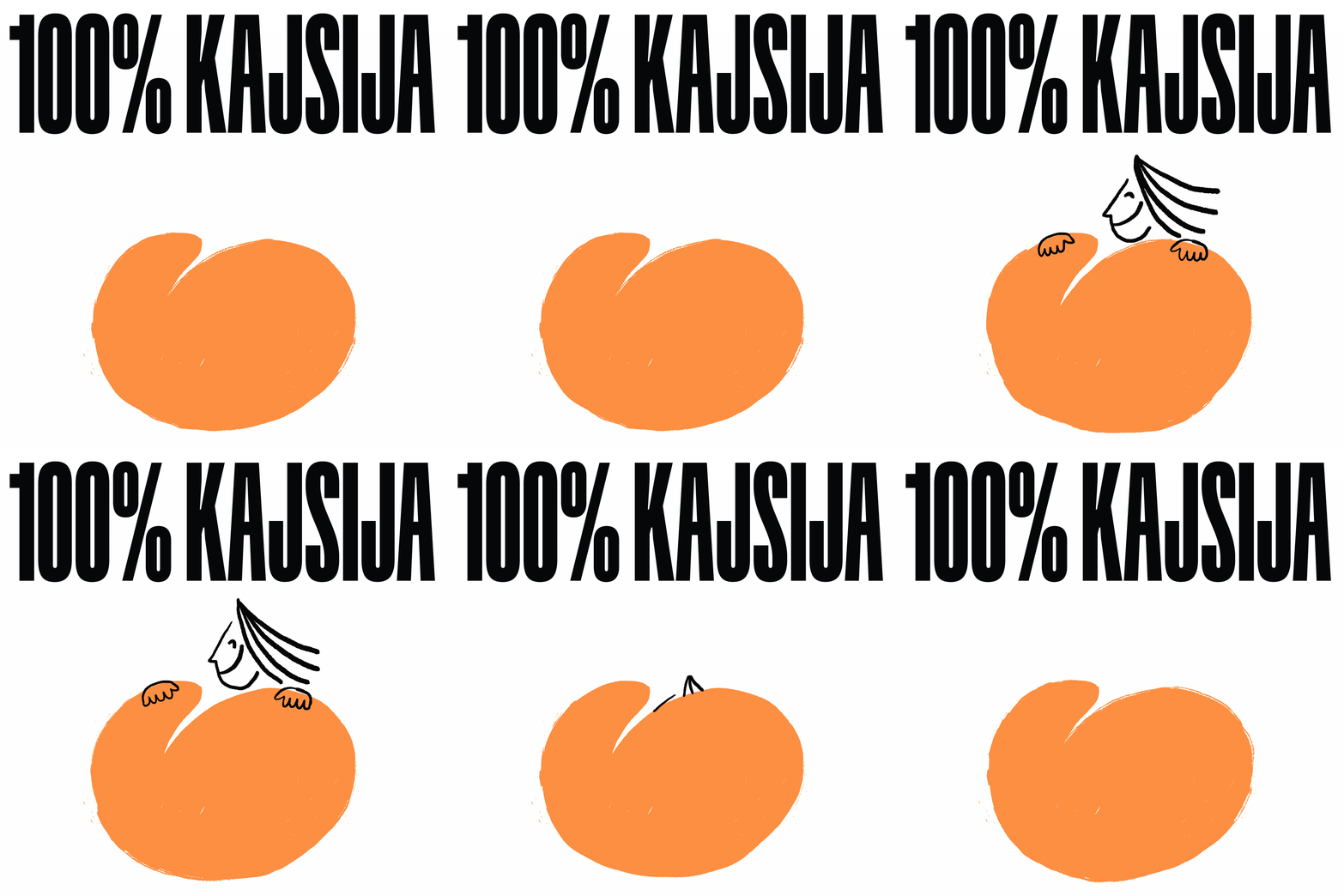
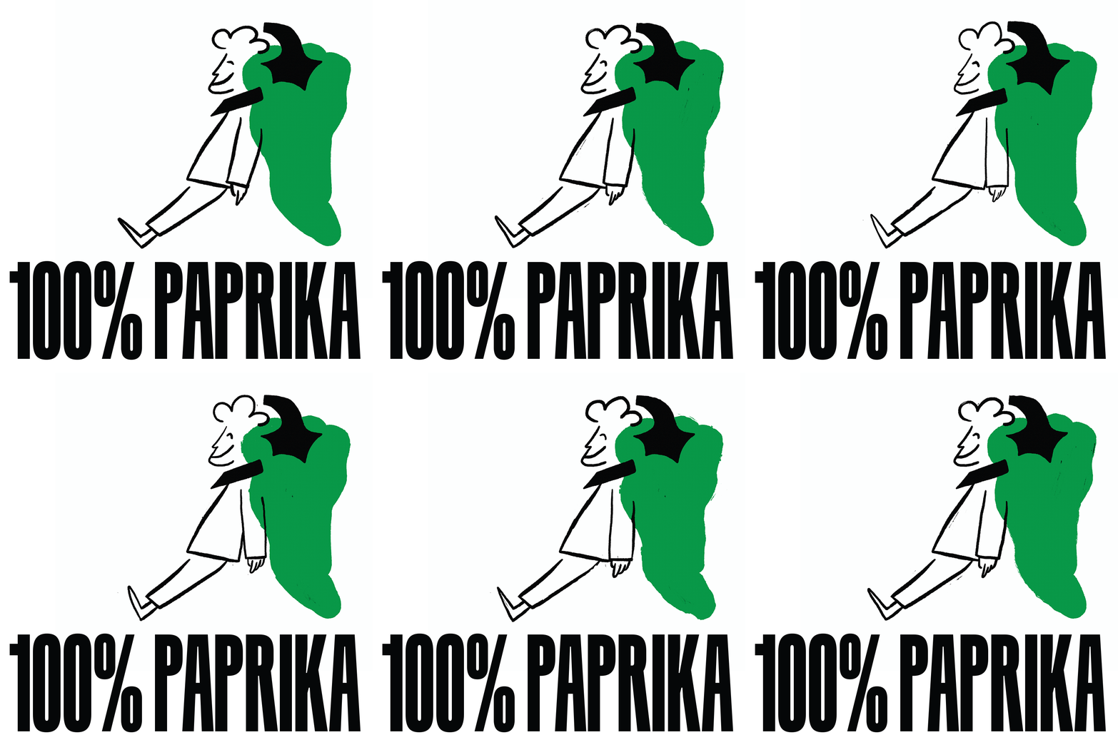
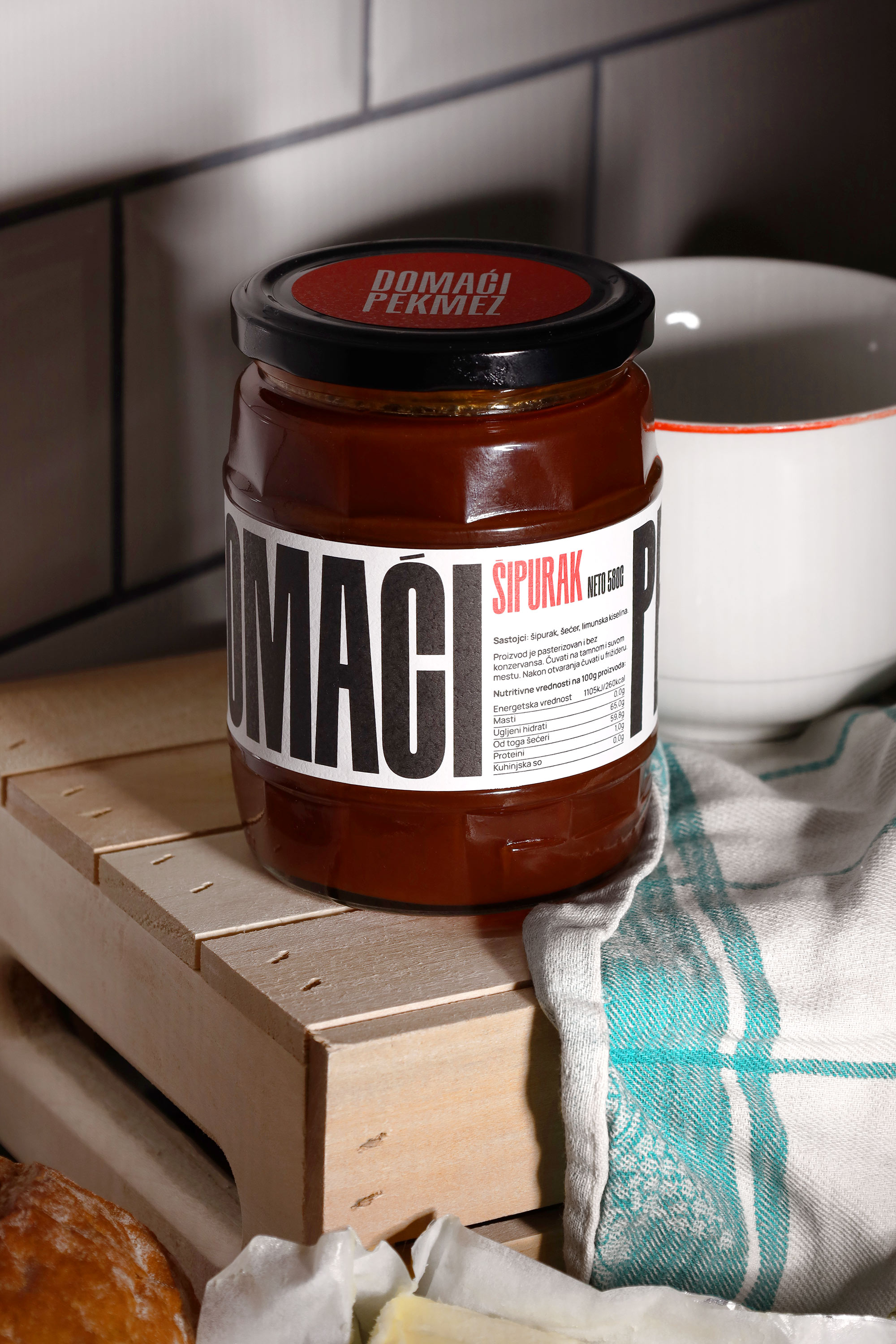
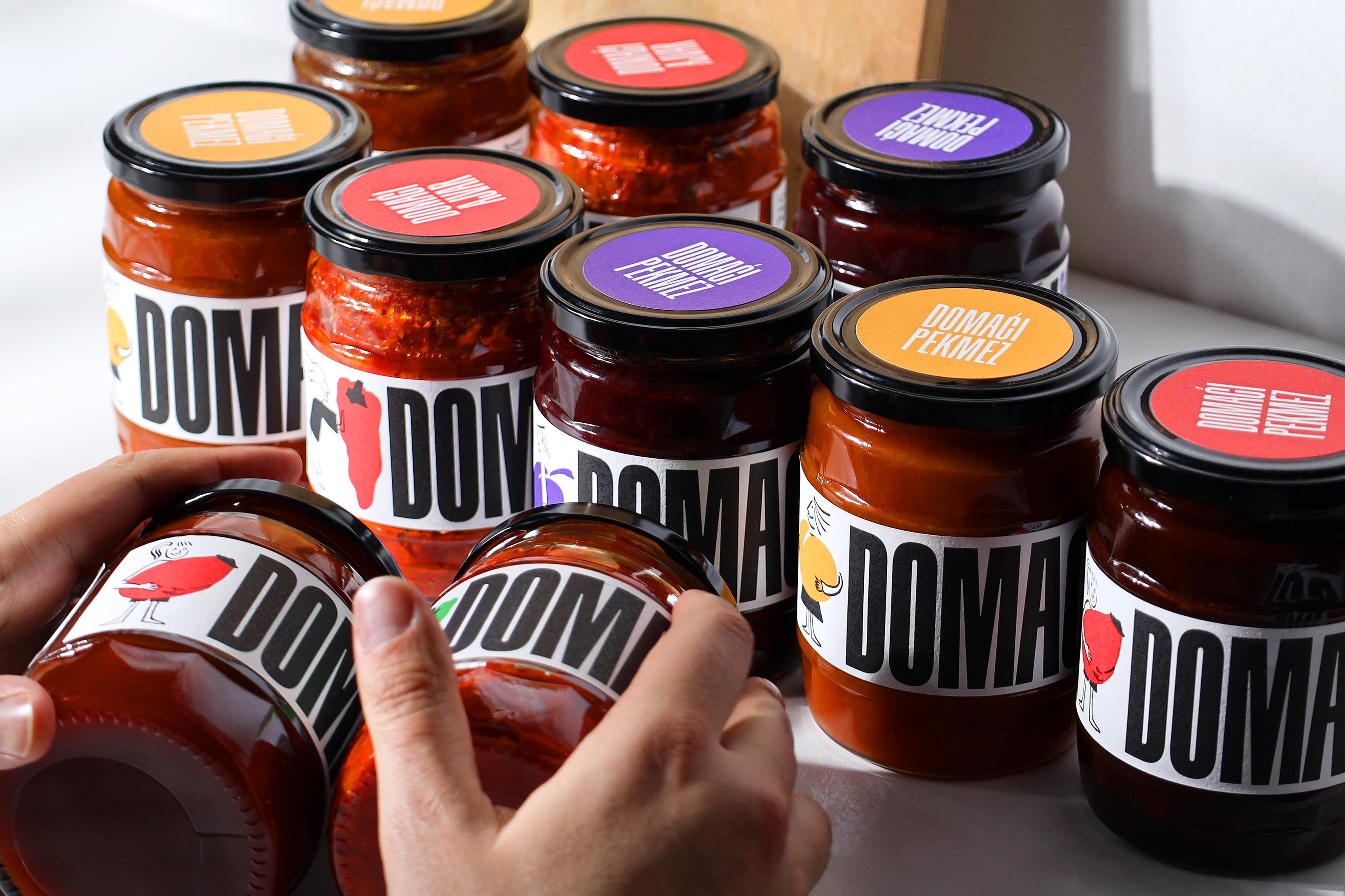
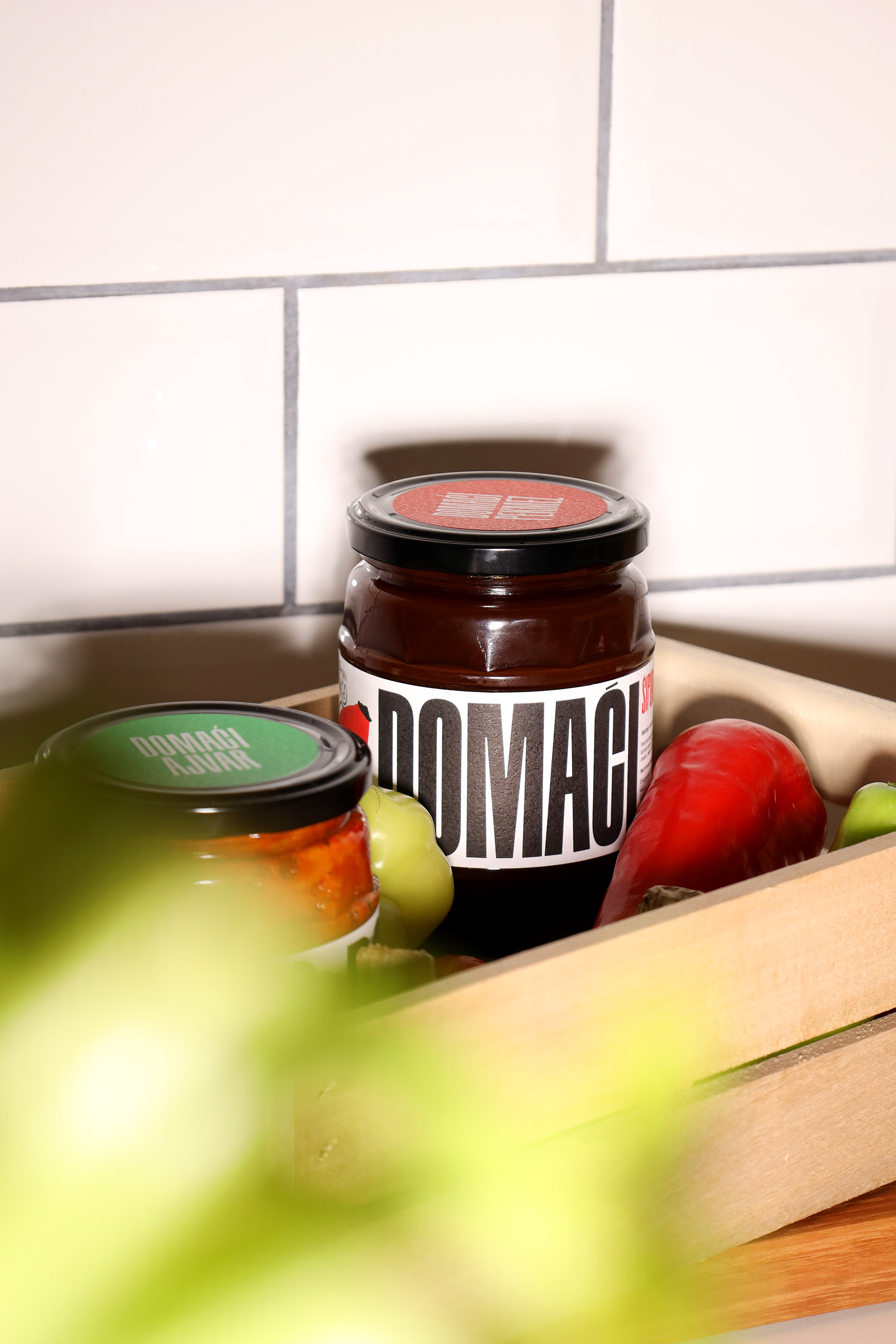
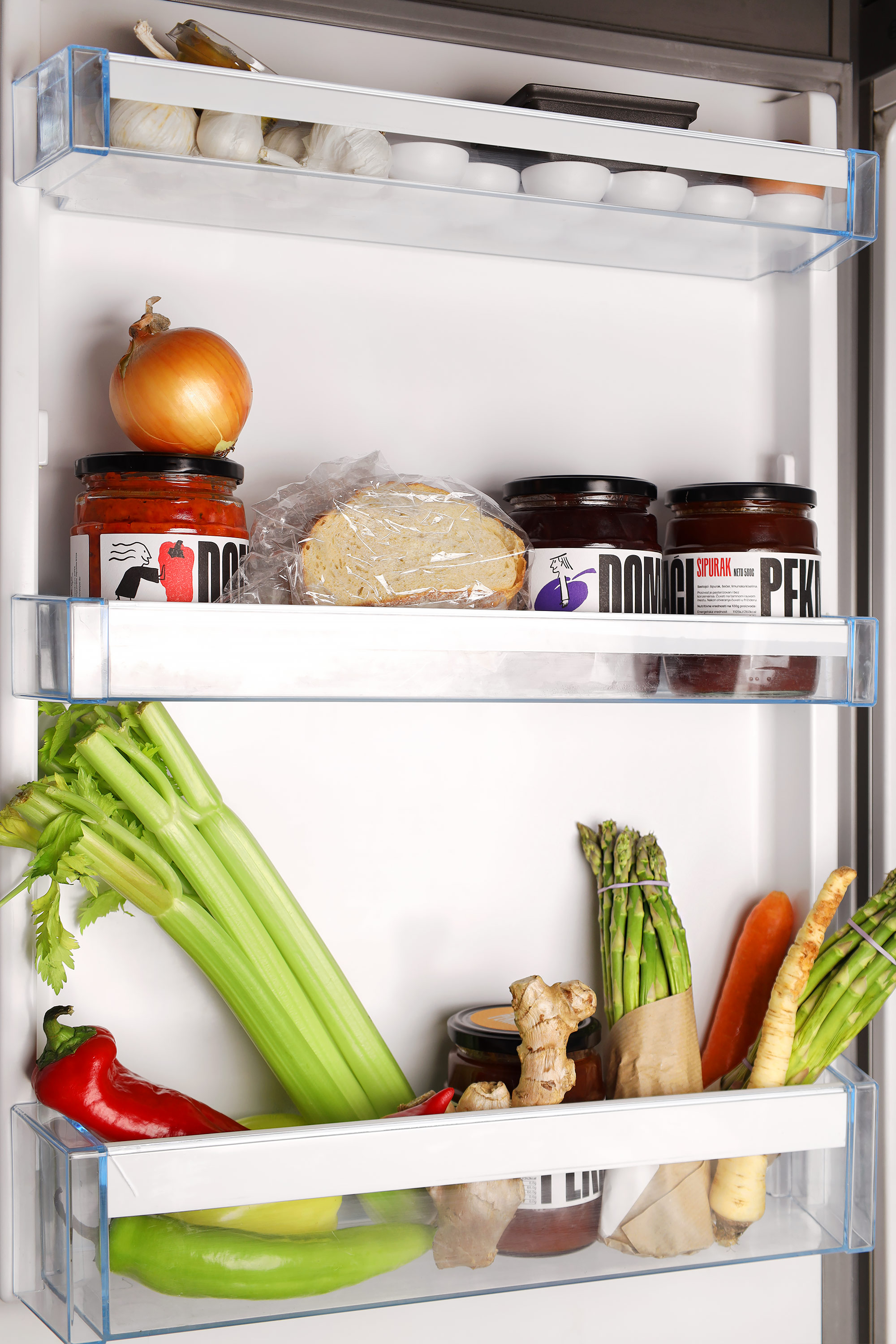
Most commonly, the colorful jars of cherished spreads are either found in vernacular packaging (i.e. reused jars with handwritten stickers) when made in a domestic setting or wrapped up in labels with traditional patterns and decorative motifs in a commercial context. This was our initial thought when coming up with the identity direction for the Kopex brand, deciding on the one that would bring a fresh prospect to the customary food niche.
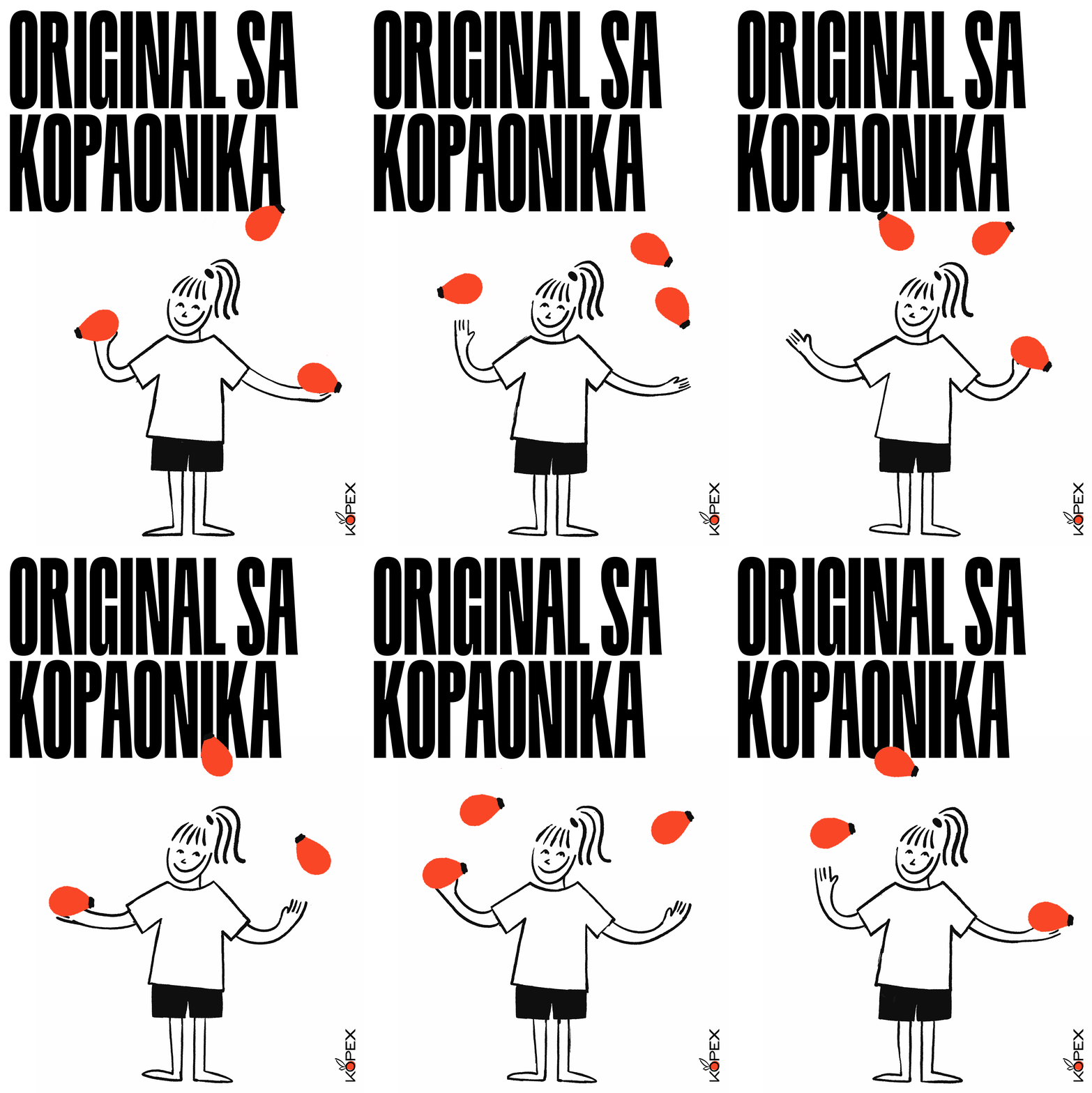
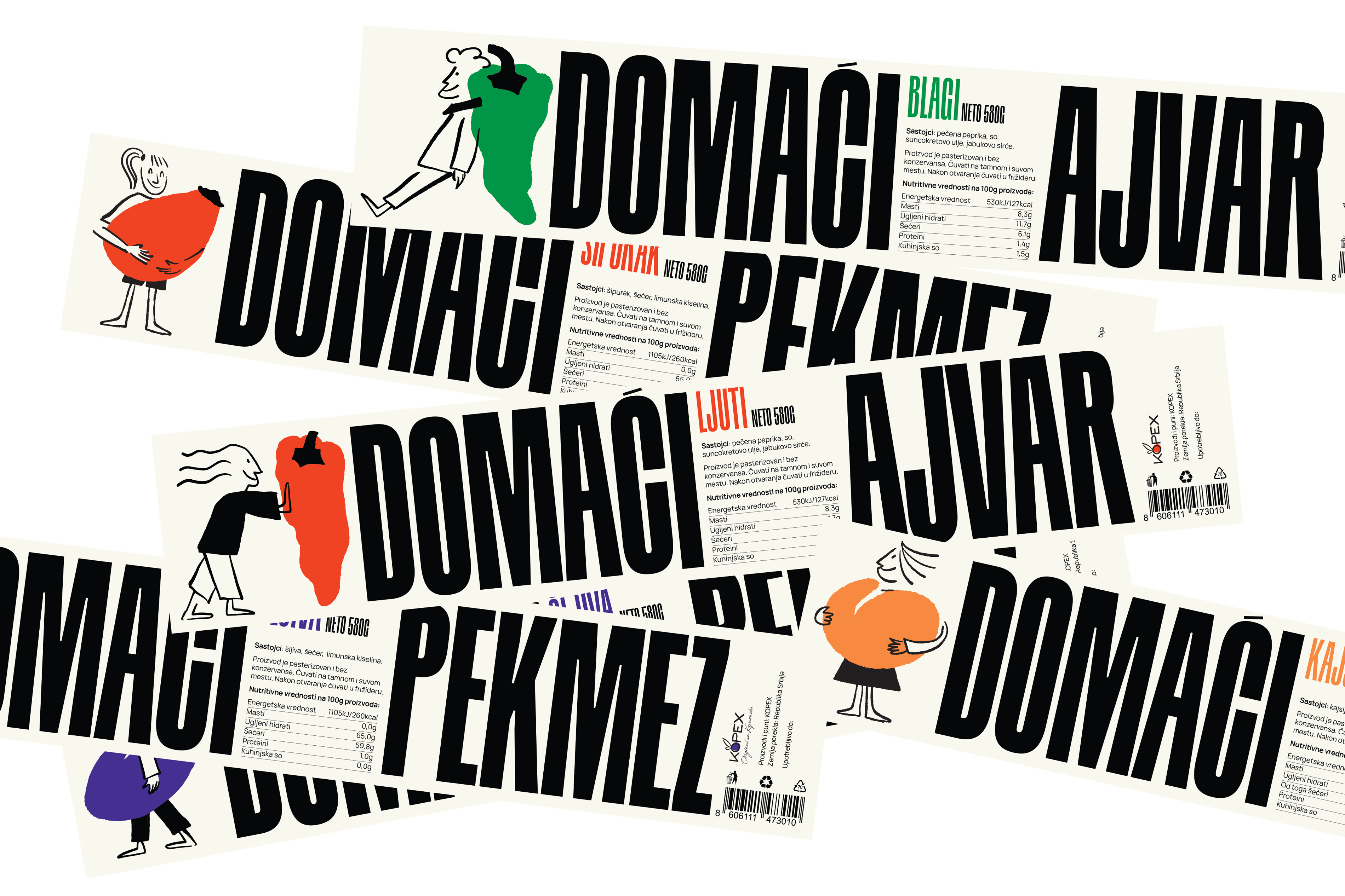
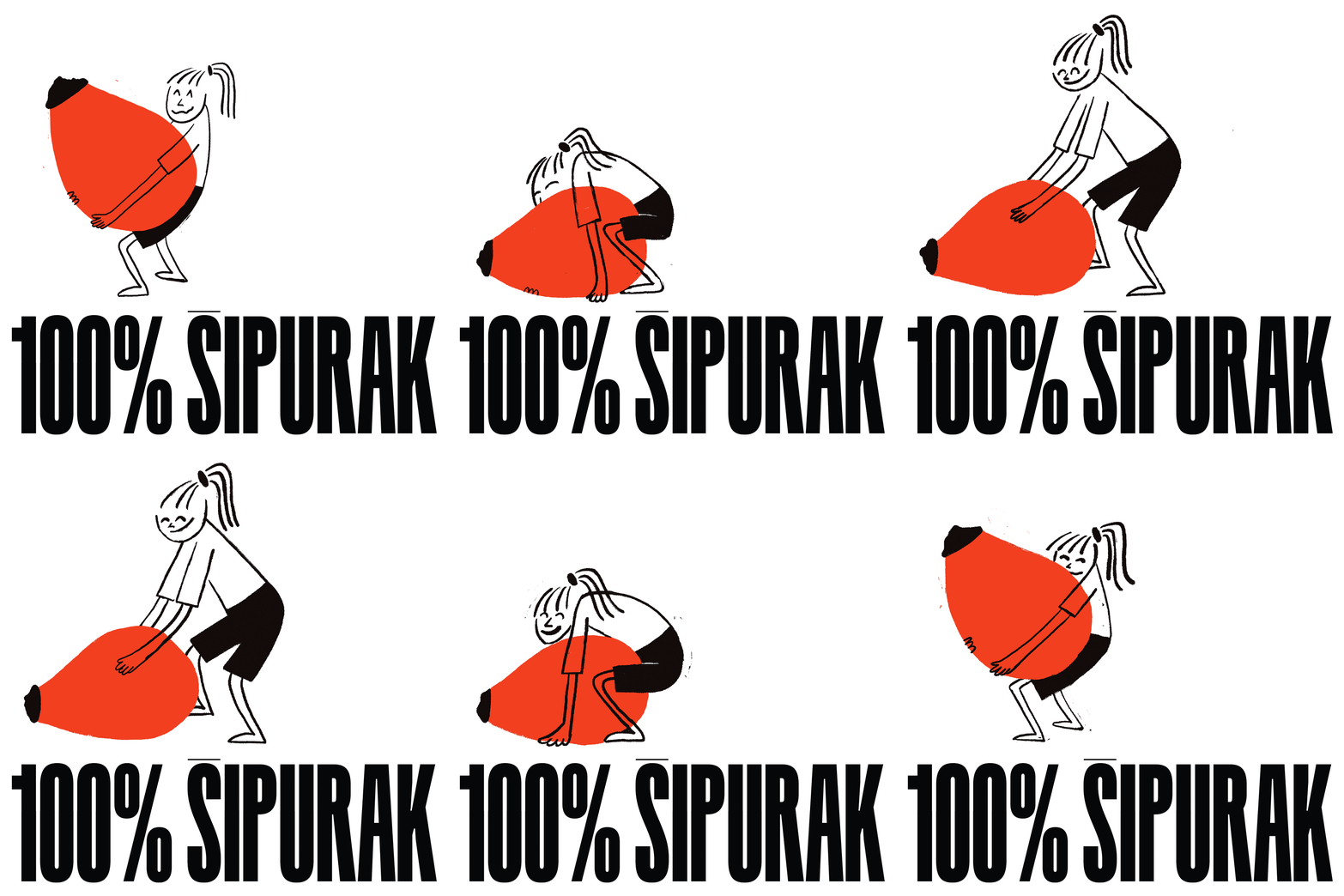
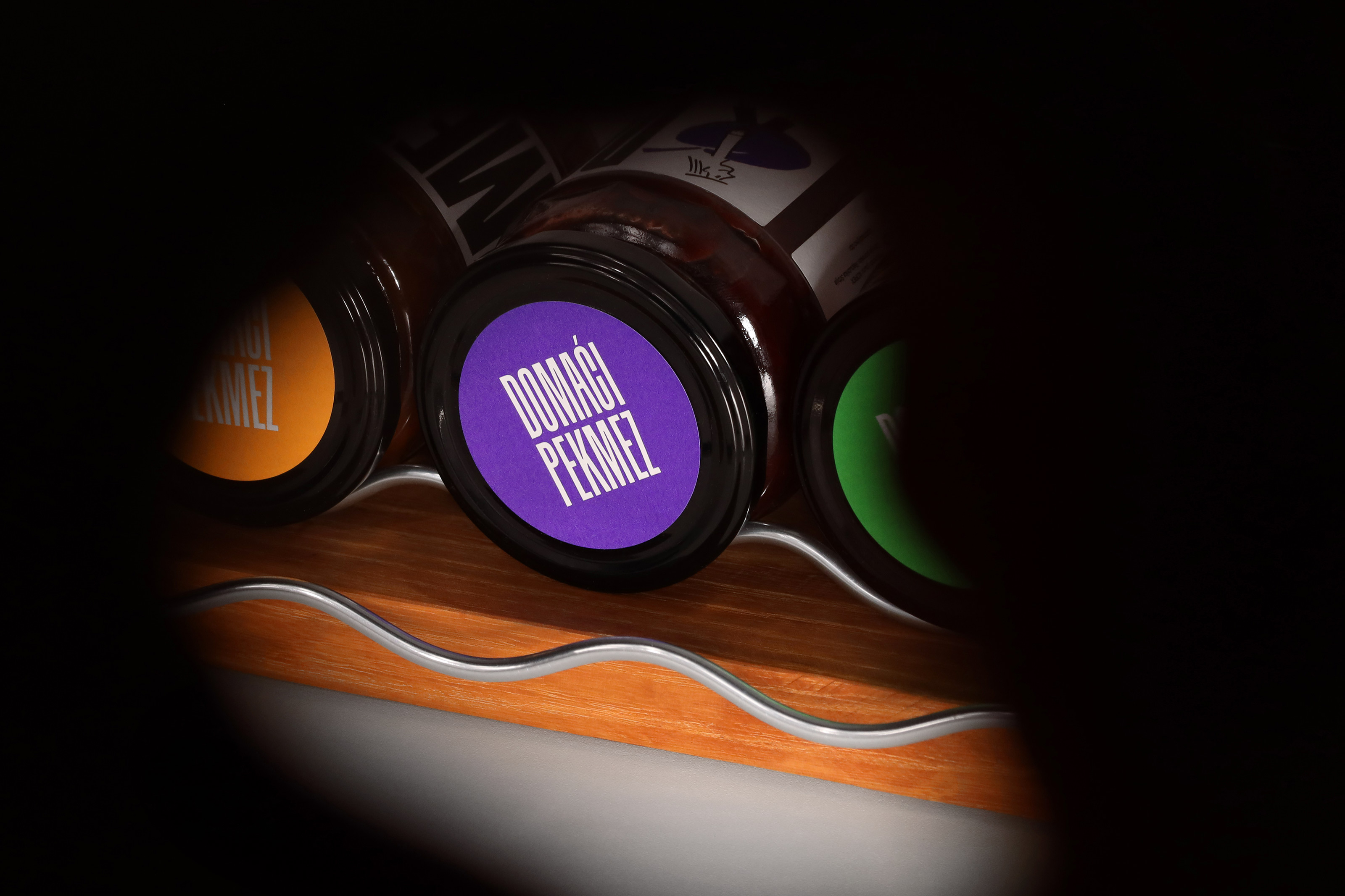
Our first clue was to change how the jar is perceived- from a commonplace object to a more conceptual item by applying an eye-catching label with a thick oversized typography prompting a rotational gesture. The main information is noticeable even from the last aisle- that Kopex ajvars and jams are exquisite domestic products. As a counterbalance to the heavy typography, we doodled a few light sketches in the style of newspaper comic strips, with lively characters interacting with fruits and vegetables. For the website, we additionally animated this cheerful troupe to perform acts such as juggling peppers to entertain the visitors. The overall idea was to diverge from the conventional representation of traditional food products and offer a more daring design, the one that makes these fine products stand out of the crowd.
SRB
Bulevar Despota Stefana 10
11000 Belgrade
studio@korakstudio.com
+381 65 6502200
UK
Business Design Centre,
52 Upper Street, London
studio@korakstudio.com
+44 20 711 28853
Get in touch:
studio@korakstudio.com
Jobs & Internships:
jobs@korakstudio.com
Socials:
Instagram
Behance
LinkedIn
©2025 Korak Studio
