Pinokio Puppetry — Half a Century of Play
Year: 2022
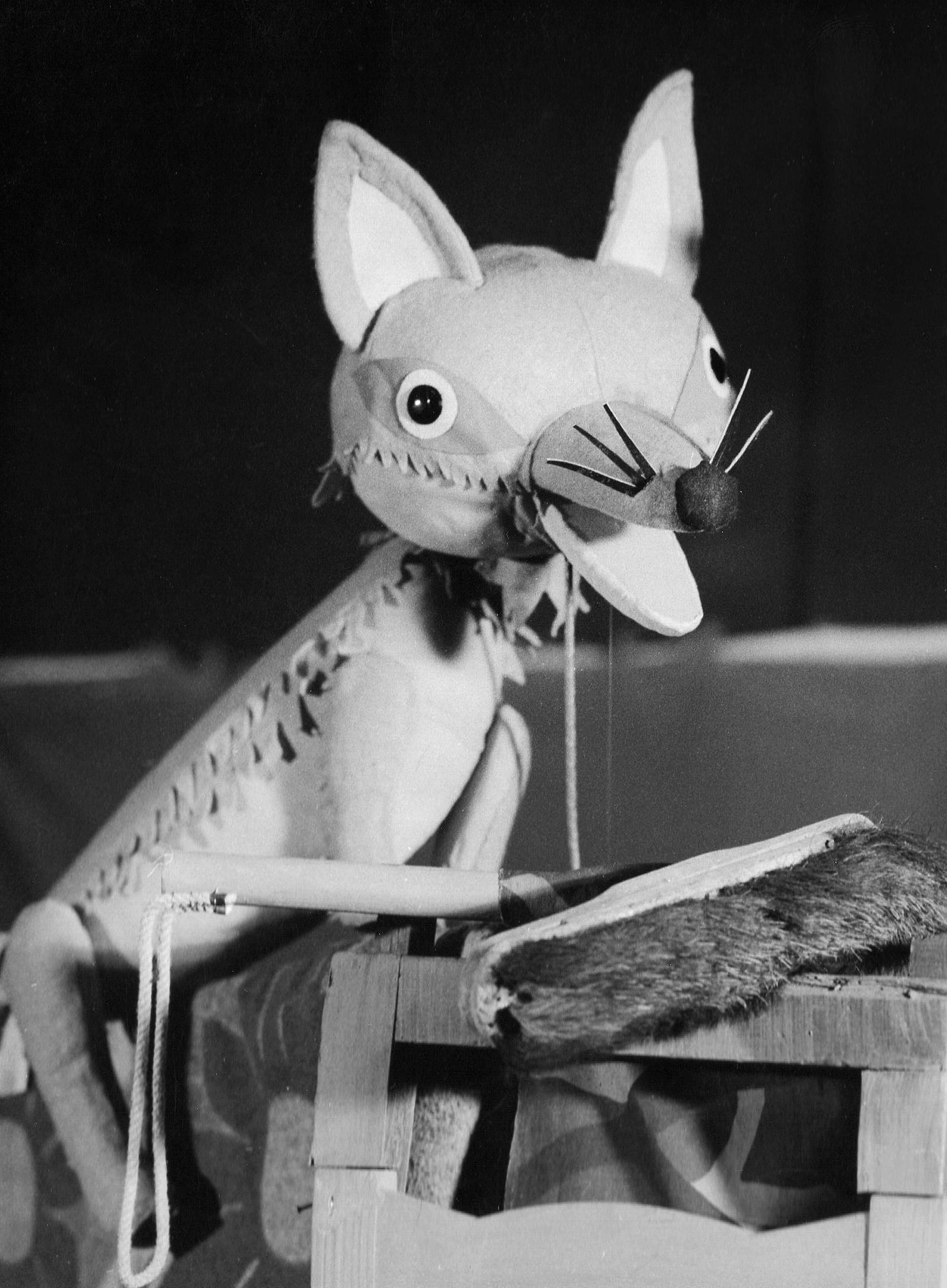
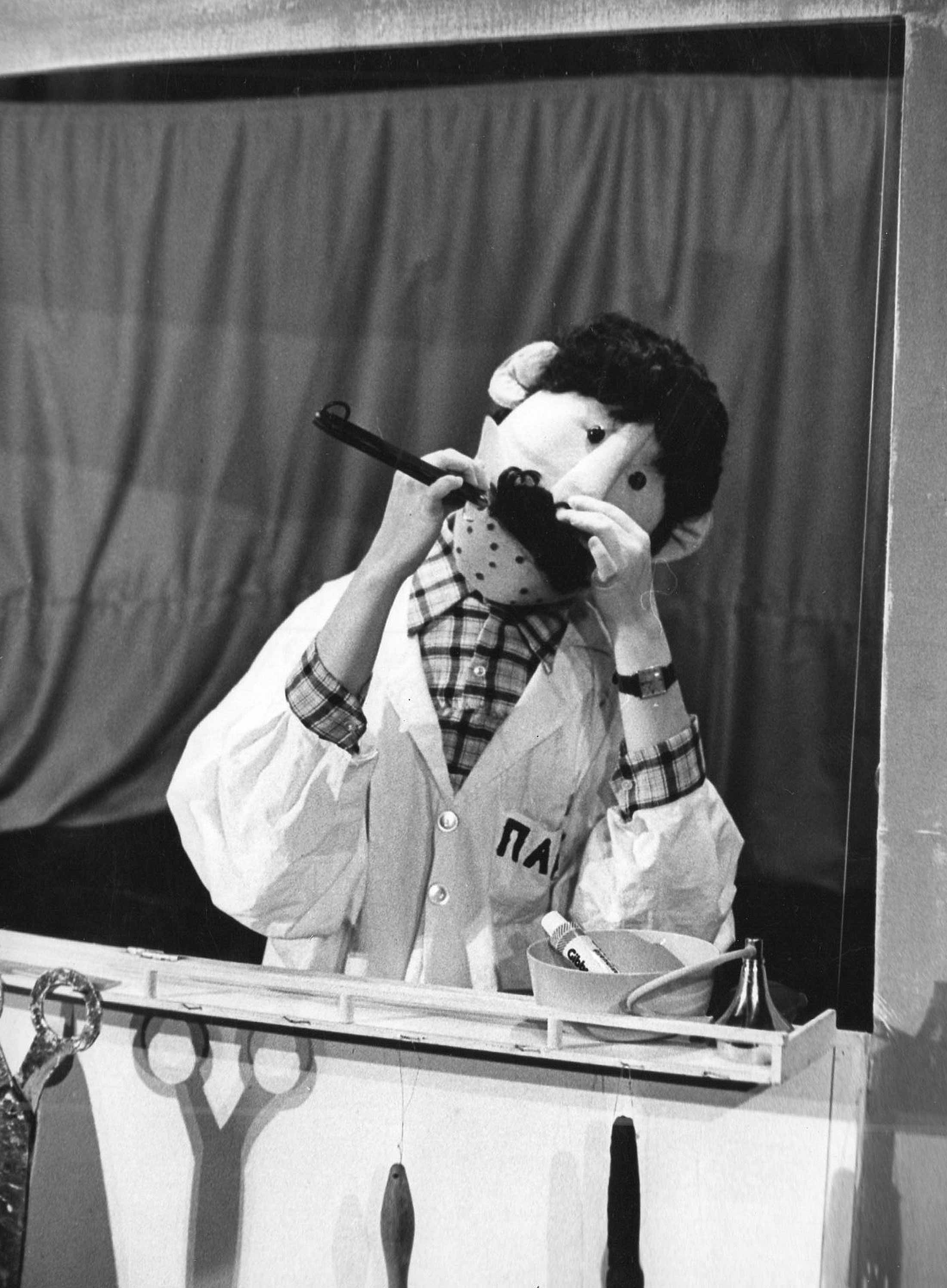
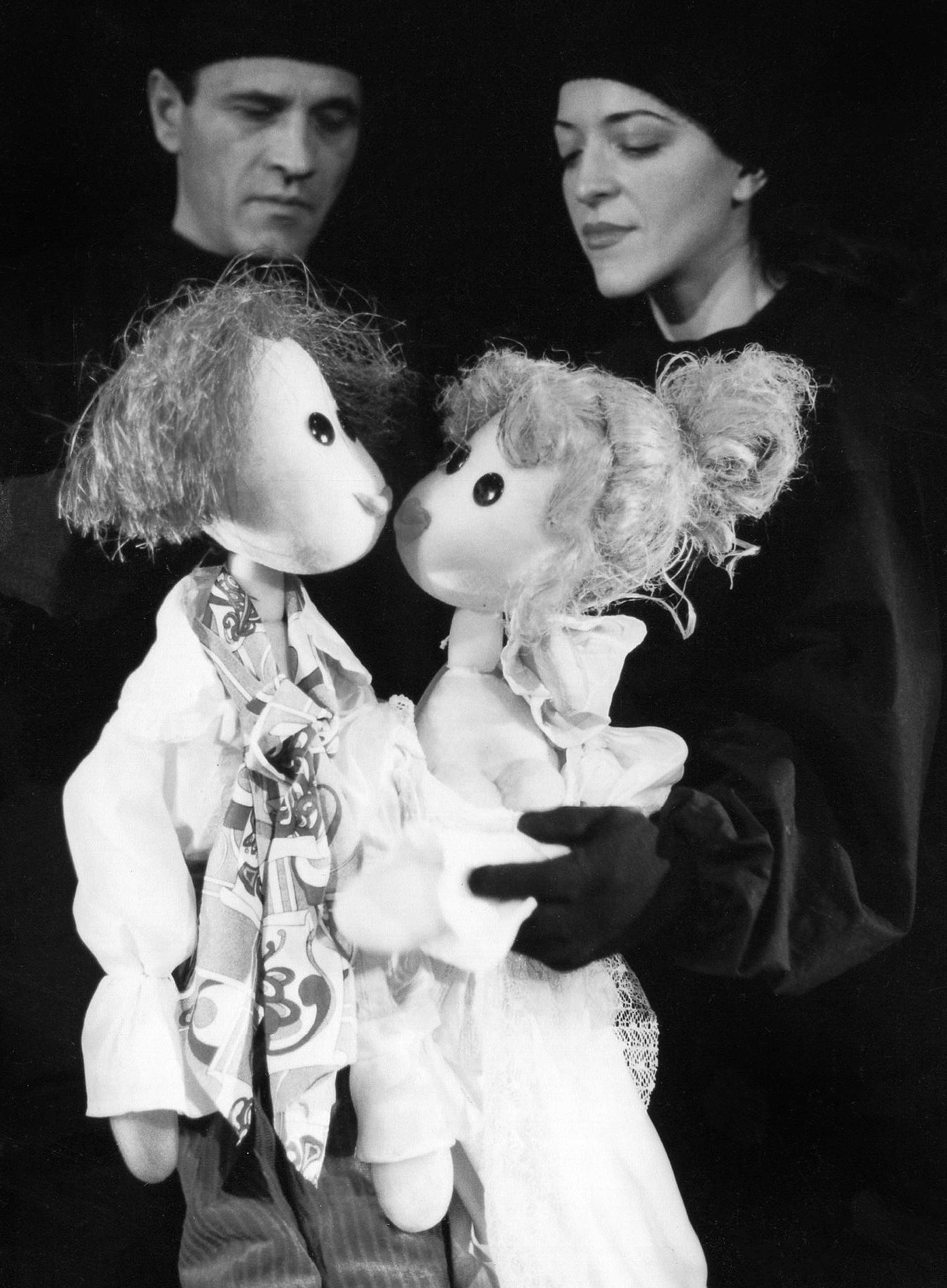
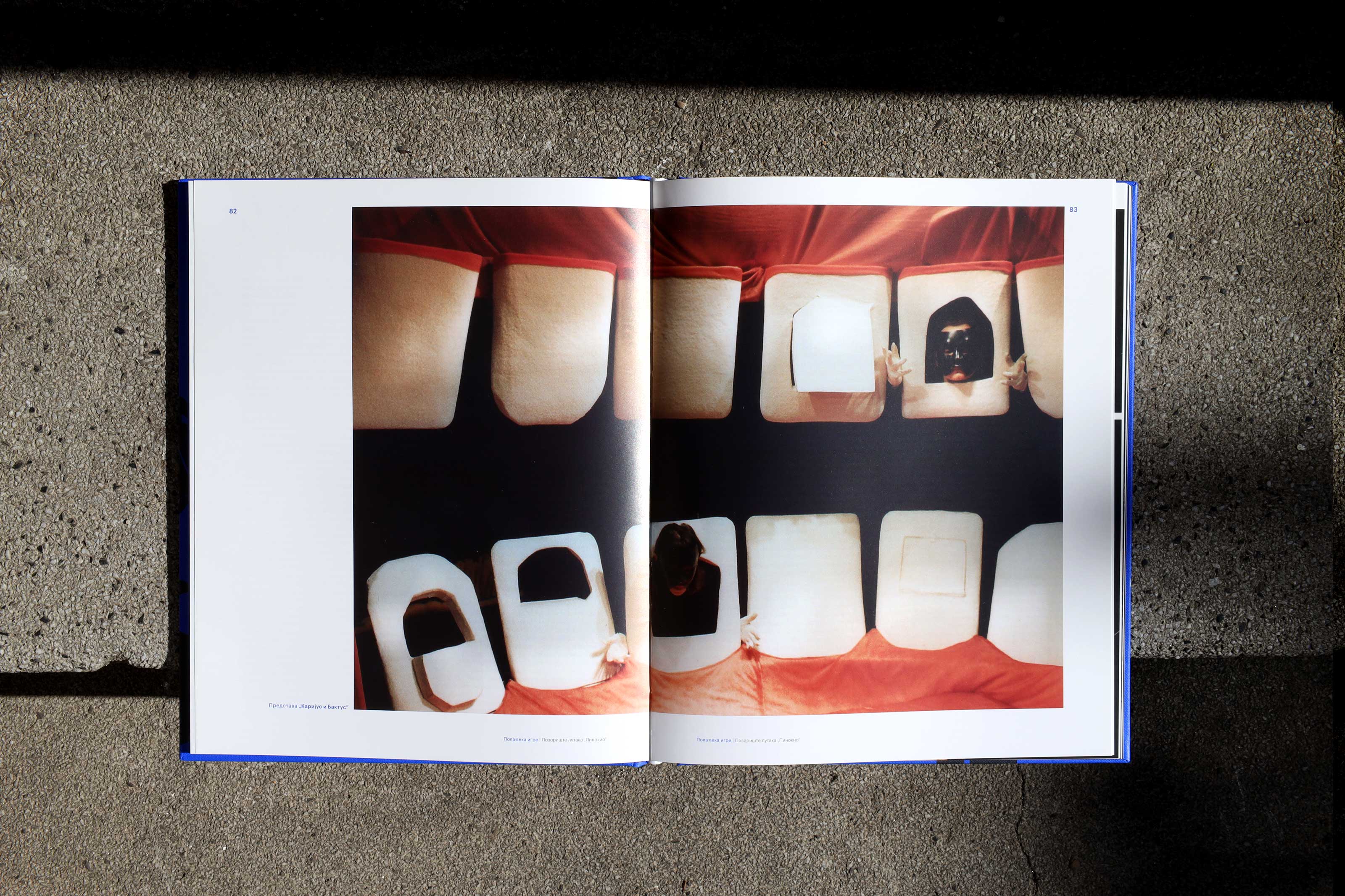
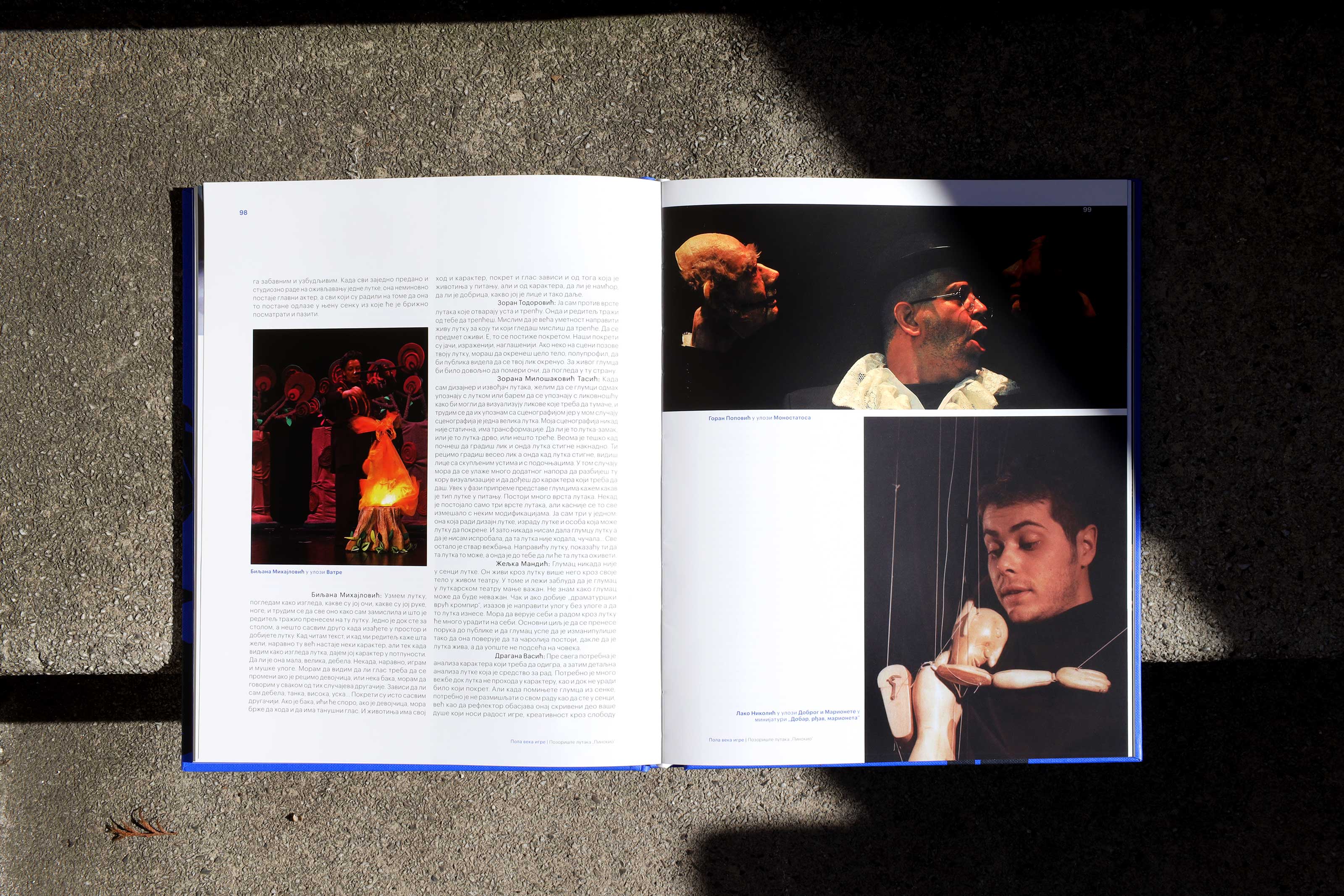
Originally founded as a travelling theatre by the director Živomir Joković in 1972, the puppet theatre “Pinocchio” has since built a reputation as the only professional theatre of this kind in Belgrade as well as one of the most important cultural institutions for children in Serbia. Now housed in the modernist building of a former cinema in New Belgrade, the theatre boasts a rich repertoire of plays built on motifs of classical fairy tales, myths, legends and epic poetry often combined with shadow theater and acting.
Client: Pinokio Puppetry, Belgrade, Serbia
Services: Identity + Illustration + Print + Signage
Creative Direction: Kosta Rakićević
Design: Nina Hadživuković, Kosta Rakićević
Illustration: Nataša Stamatović
Photo: Nataša Stamatović
Account Management: Ana Stanojčić


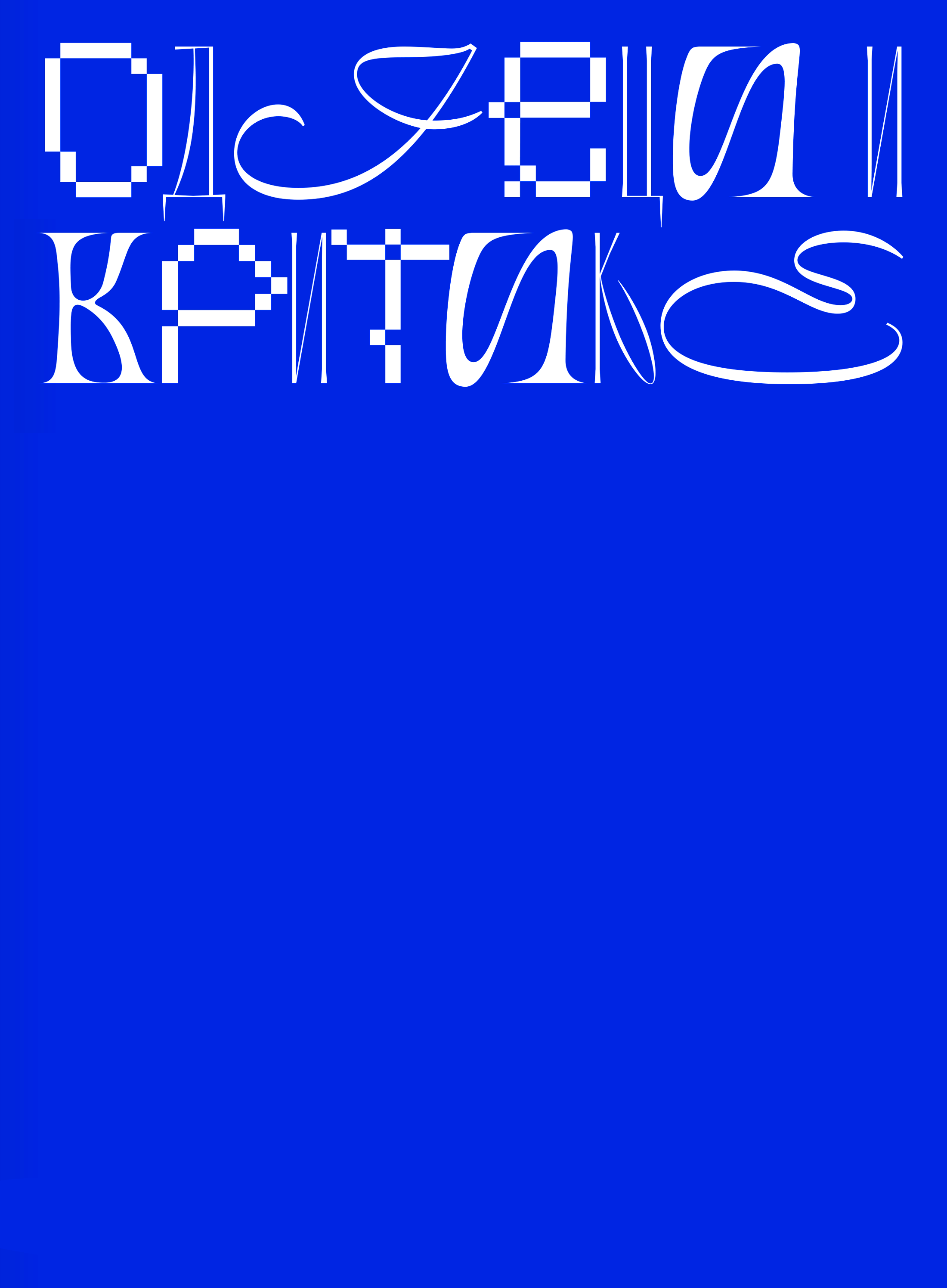
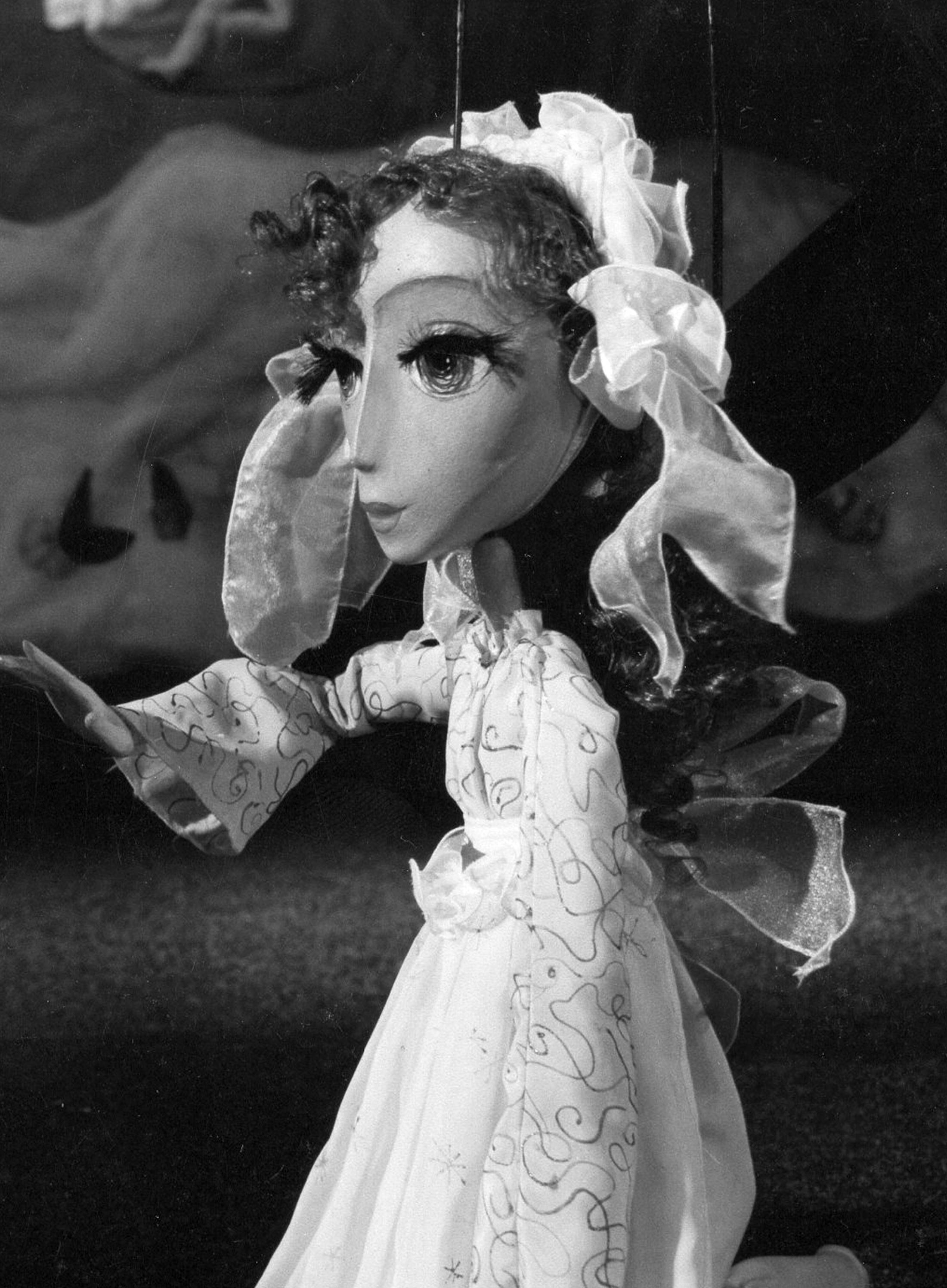
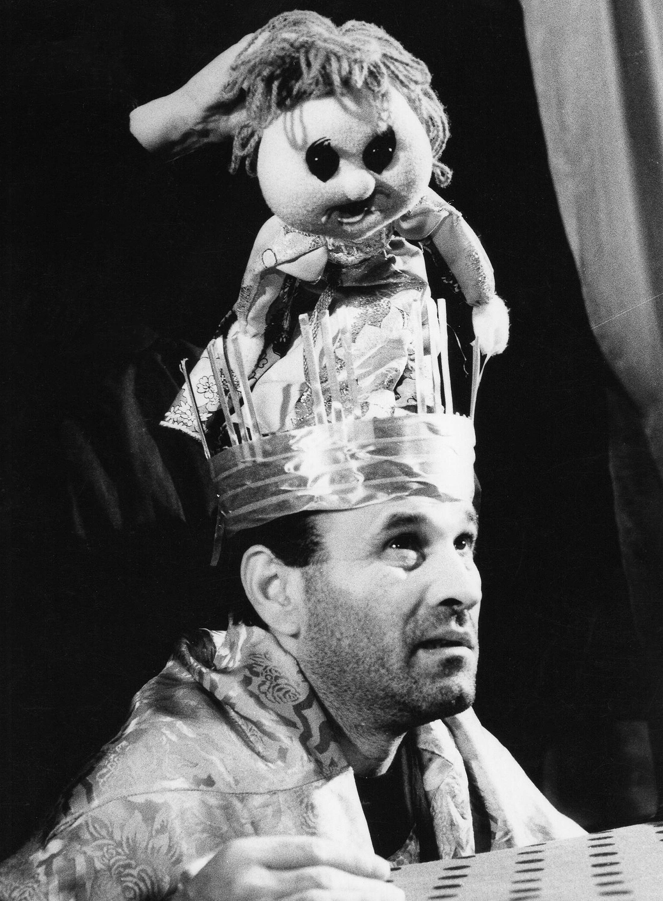
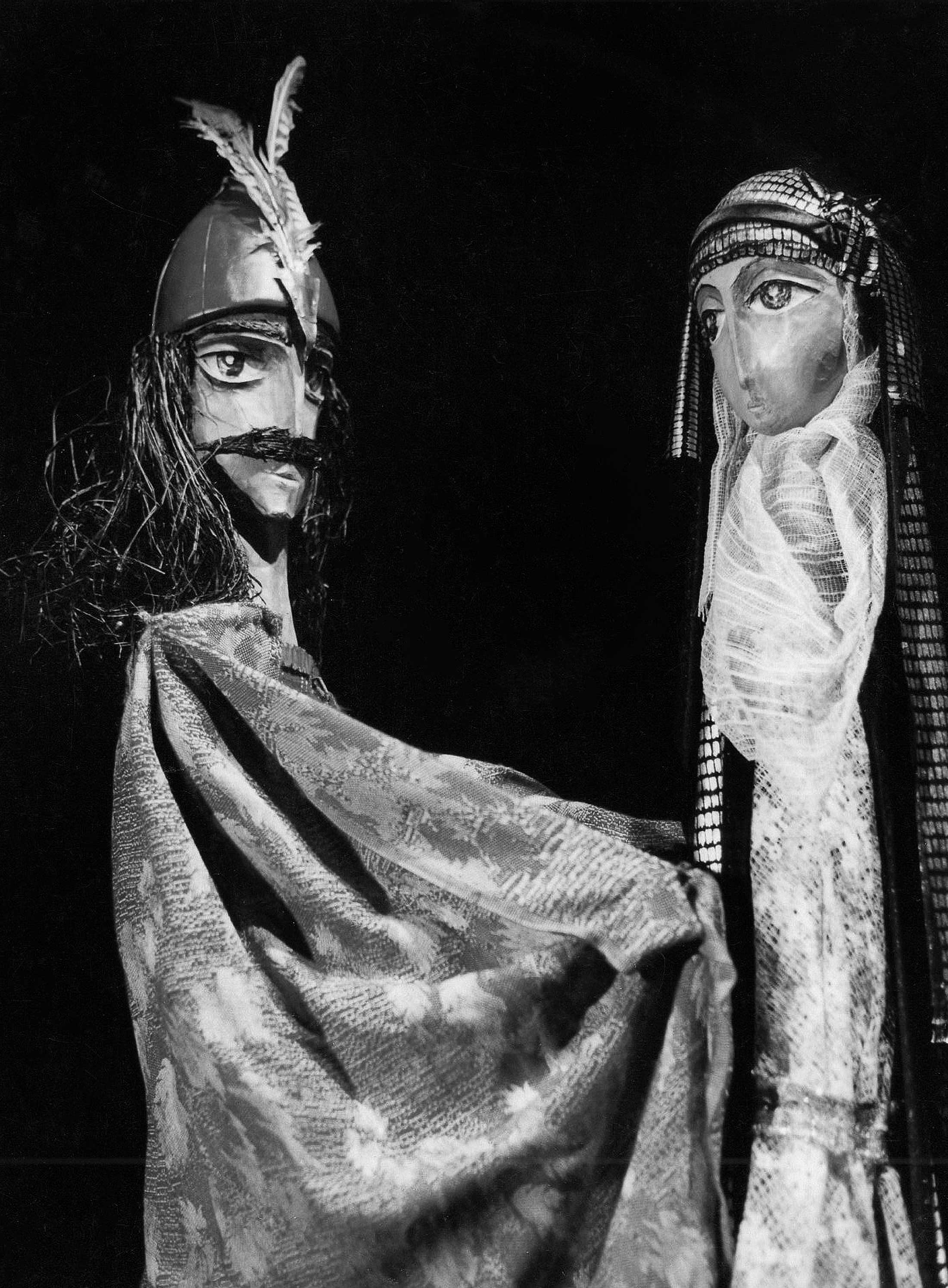

On the occasion of its 50th anniversary, our studio was asked to create a visual identity of the jubilee including a monograph of the theatre. We took this as an invitation to step on the stage and explore the fantastic world of characters and their adventures, drawing inspiration from the jubilee’s tagline- Half a Century of Play.
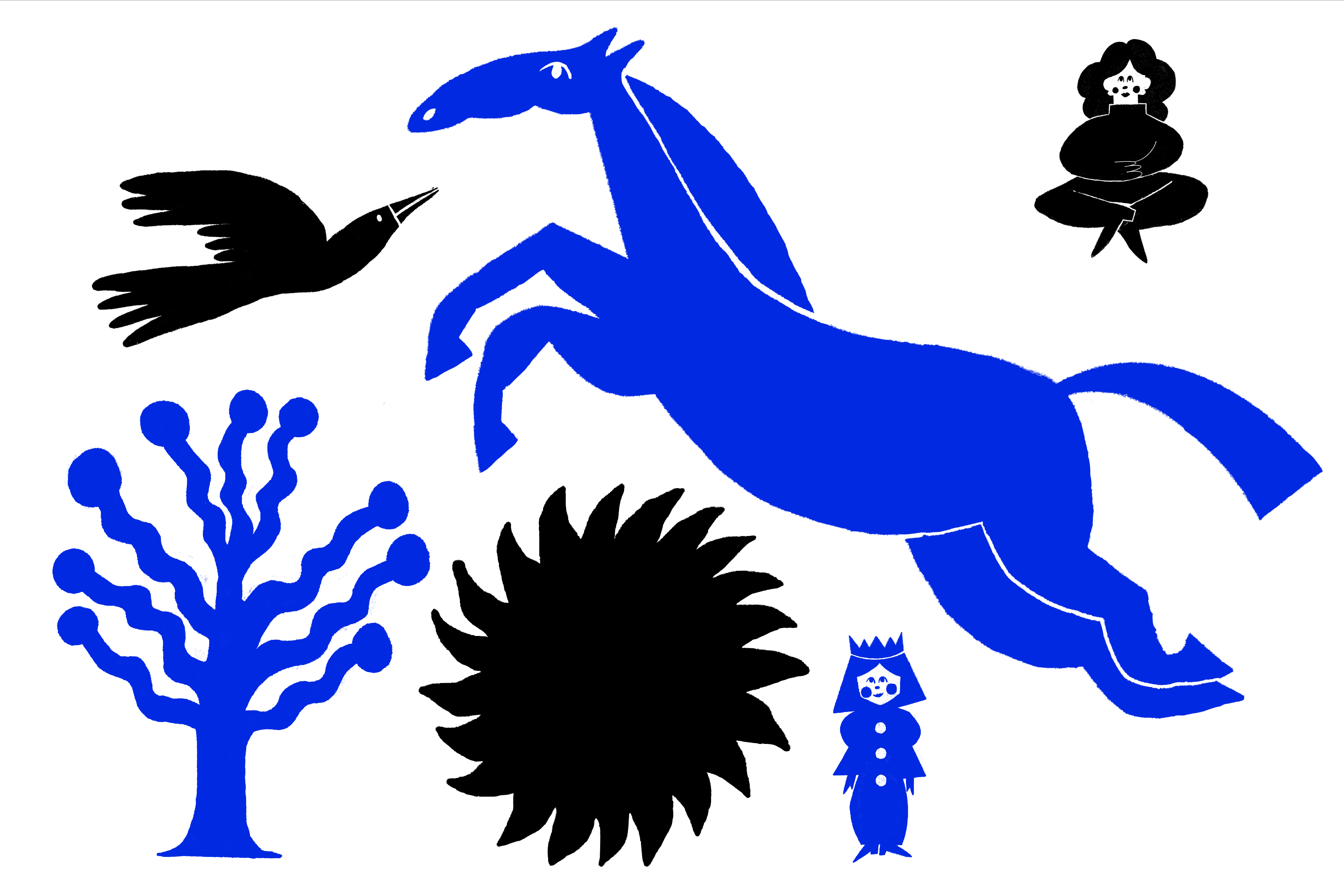
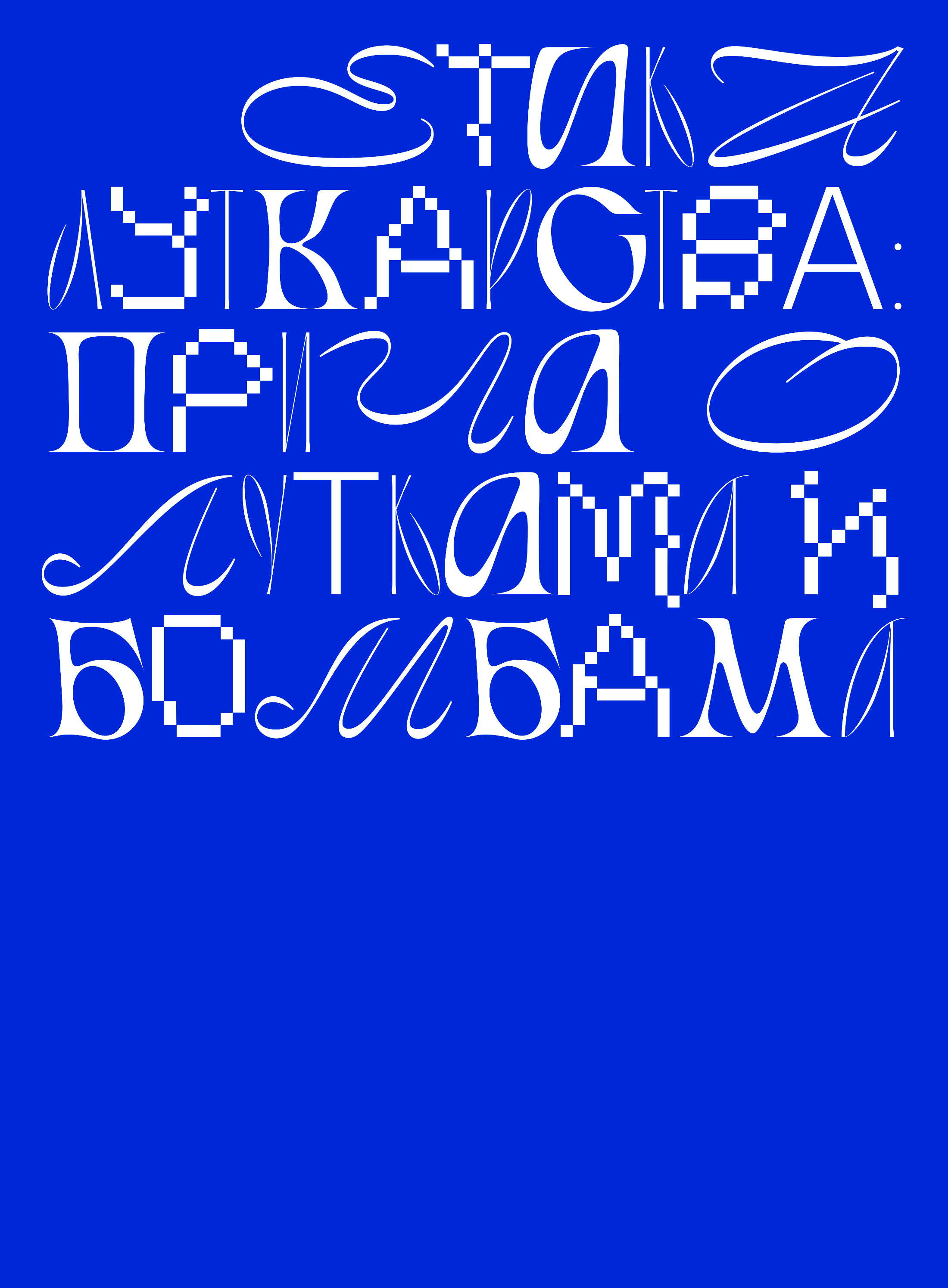
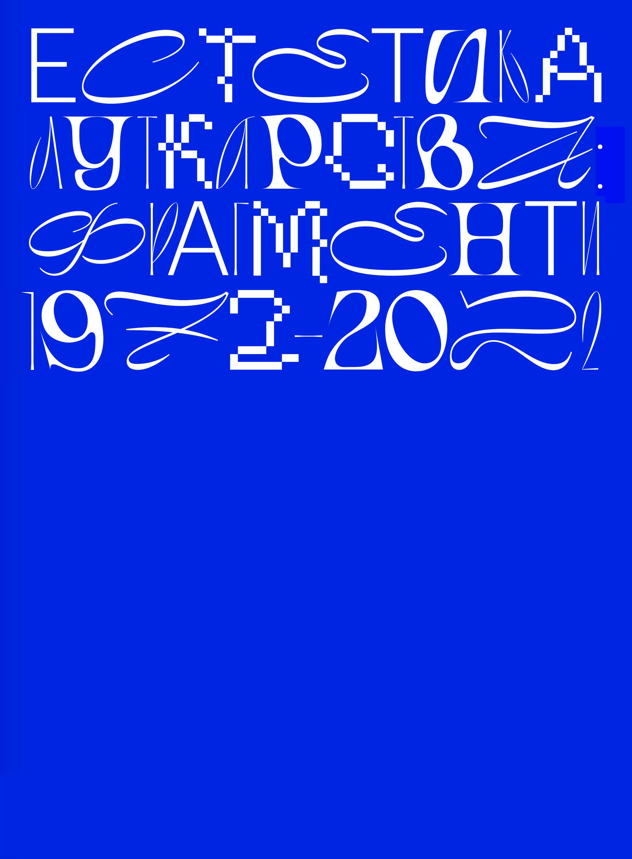
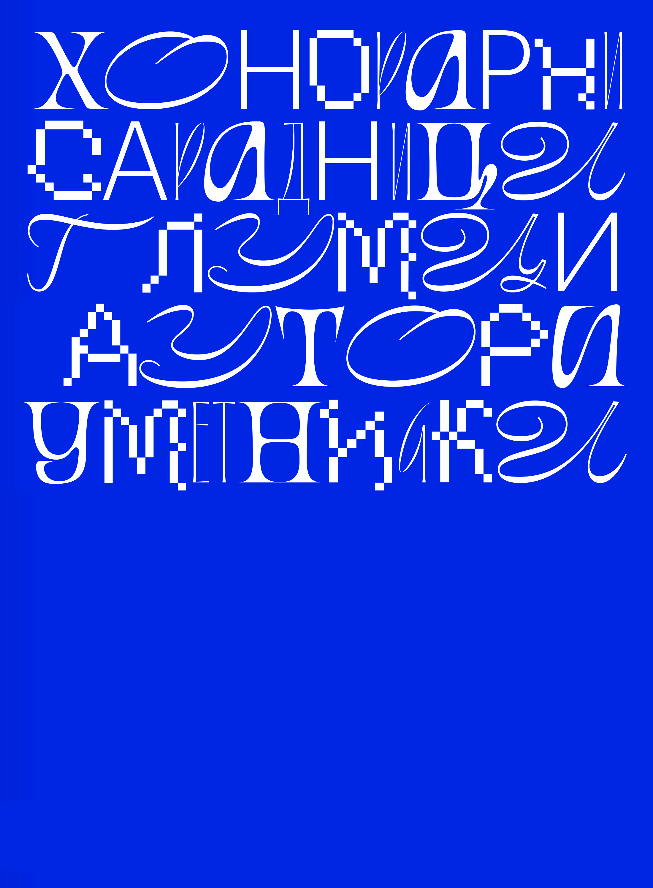
Our approach was spontaneous and playful, taking bits and pieces from various design and typography directions, combining frisky lettering with simple and cheerful illustrations while keeping the formal legibility a priority. The aim was to preserve the spirit of the theater’s tradition and to translate parts of the repertoire into visual language, adding an abstract quality to it by introducing much-loved characters as silhouettes seen in shadow plays. The soft and round figurative motives are intertwined with bouncy typography, giving a sense of a unified surface in which the characters and text naturally blend in. For illustrations, we drew additional visual references from impressive modernist murals decorating school walls and playgrounds of the past, with beautifully stylized figures and vivid color palettes. The dominating ultramarine blue in the jubilee’s identity came as an enhanced citation of the theatre’s traditional color-code, with a slightly increased intensity and vigor to communicate better with the contemporary sensibility.


Working on this project was more than just a production of visual identity for a client. For us, it meant a journey backward in time in order to rediscover our childhood universes full of whimsical characters and fantastic landscapes. We wanted to translate fragments of these journeys into a truly memorable aesthetic, the one we felt a theatre like Pinocchio deserves for its golden jubilee.


SRB
Bulevar Despota Stefana 10
11000 Belgrade
studio@korakstudio.com
+381 65 6502200
UK
Business Design Centre,
52 Upper Street, London
studio@korakstudio.com
+44 20 711 28853
Get in touch:
studio@korakstudio.com
Jobs & Internships:
jobs@korakstudio.com
Socials:
Instagram
Behance
LinkedIn
©2025 Korak Studio